Color is one of the most powerful tools in an artist's arsenal. It can evoke emotions, create atmosphere, guide the viewer's eye, and communicate meaning without a single word. Yet many artists approach color intuitively, missing the opportunity to harness its full potential through a deeper understanding of color theory. In this comprehensive guide, we'll explore the fundamental principles of color theory and how you can apply them to elevate your artwork.
The Color Wheel: The Foundation of Color Theory
The modern color wheel is a visual representation of color relationships that has evolved since Sir Isaac Newton's first circular diagram of colors in 1666. Understanding this tool is the first step toward mastering color theory.
Primary Colors
Primary colors are the foundation of all other colors and cannot be created by mixing other colors together:
- Red
- Yellow
- Blue
Secondary Colors
Secondary colors are created by mixing two primary colors in equal amounts:
- Orange (Red + Yellow)
- Green (Yellow + Blue)
- Purple (Blue + Red)
Tertiary Colors
Tertiary colors are created by mixing a primary color with an adjacent secondary color:
- Red-Orange
- Yellow-Orange
- Yellow-Green
- Blue-Green
- Blue-Purple
- Red-Purple
Together, these twelve colors form the basic color wheel that serves as a reference for color relationships.
Color Properties: Understanding the Dimensions of Color
Each color has three main properties that define its appearance:
Hue
Hue is what we typically think of as "color" – the attribute that distinguishes one color from another (red, blue, green, etc.). It represents the dominant wavelength of light that we perceive.
Value (Lightness/Darkness)
Value refers to the lightness or darkness of a color. Adding white to a hue creates a tint (lighter value), while adding black creates a shade (darker value). Value is crucial for creating depth, volume, and focus in artwork.
Saturation (Intensity/Chroma)
Saturation describes the purity or intensity of a color. Highly saturated colors appear vibrant and rich, while less saturated colors appear more muted or gray. Adjusting saturation helps control the emotional impact and focal points in your composition.
Color Harmonies: Creating Pleasing Color Combinations
Color harmonies are specific combinations of colors based on their positions on the color wheel. These relationships create different aesthetic and emotional effects.
Complementary Colors
Complementary colors are directly opposite each other on the color wheel (e.g., red and green, blue and orange, yellow and purple). When placed side by side, complementary colors create maximum contrast and vibration, making each appear more intense.
Applications: Use complementary colors to create focal points, energize compositions, or make elements pop. However, use them judiciously, as they can be visually jarring in large areas.
Analogous Colors
Analogous colors are groups of three to five colors that are adjacent to each other on the color wheel (e.g., yellow, yellow-green, and green). These combinations are harmonious and pleasing to the eye.
Applications: Use analogous color schemes to create a sense of cohesion and harmony. They work well for landscapes, serene compositions, and creating mood without strong contrast.
Triadic Colors
Triadic color schemes use three colors that are evenly spaced around the color wheel (e.g., red, yellow, and blue). This arrangement offers strong visual contrast while maintaining balance and color richness.
Applications: Use triadic colors for vibrant, balanced designs. Often, it works best to let one color dominate while using the others as accents.
Split-Complementary Colors
A split-complementary scheme uses a base color and the two colors adjacent to its complement. This provides high contrast but with less tension than complementary color schemes.
Applications: This is a versatile color scheme that's hard to get wrong, offering vibrance while being less jarring than pure complementary schemes.
Monochromatic Colors
Monochromatic color schemes use variations in lightness and saturation of a single hue. These create a cohesive, sophisticated look with limited palette.
Applications: Perfect for creating subtle, elegant compositions or conveying a specific mood. Particularly effective in minimalist art or when focusing on texture and form.
Color Temperature: Warm vs. Cool
Colors are often categorized as either warm or cool:
Warm Colors
Reds, oranges, yellows, and yellow-greens are considered warm colors. They typically evoke feelings of energy, passion, happiness, and comfort. Warm colors appear to advance toward the viewer, making objects seem closer than they are.
Cool Colors
Blues, purples, and blue-greens are considered cool colors. They typically evoke feelings of calmness, serenity, sadness, or detachment. Cool colors appear to recede from the viewer, making objects seem farther away.
Applications: Understanding color temperature helps create depth (cool colors for backgrounds, warm for foregrounds), set mood (warm for energetic scenes, cool for calm ones), and direct attention (warm colors naturally draw the eye).
Color Psychology: The Emotional Impact of Colors
Colors can evoke specific psychological and emotional responses in viewers. While these associations can vary across cultures and individuals, some common associations include:
- Red: Passion, energy, danger, importance, love
- Orange: Enthusiasm, creativity, determination, attraction, success
- Yellow: Happiness, intellect, energy, attention-grabbing
- Green: Growth, harmony, freshness, safety, nature
- Blue: Trust, loyalty, wisdom, confidence, serenity
- Purple: Royalty, luxury, ambition, creativity, wisdom
- White: Purity, cleanliness, innocence, simplicity
- Black: Power, elegance, formality, mystery, death
Applications: Consider the emotional response you want to evoke in your viewers when selecting your color palette. Colors can dramatically affect how your artwork is perceived and experienced.
Practical Color Theory Applications in Art
Creating Depth with Color
Colors can create the illusion of depth through several principles:
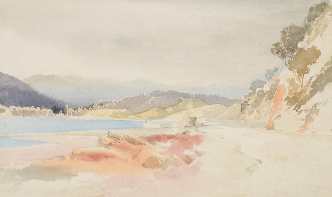
- Aerial/Atmospheric Perspective: Objects in the distance appear lighter, cooler, and less saturated due to atmospheric interference. Use this principle by gradually decreasing saturation and contrast as elements recede into the background.
- Warm/Cool Contrast: Warm colors appear to advance while cool colors recede. Use warmer colors for foreground elements and cooler colors for backgrounds.
- Saturation Contrast: Highly saturated colors draw attention and appear closer than desaturated colors.
Creating Focal Points with Color
Direct the viewer's attention using these color strategies:
- Contrast of Hue: An element with a different hue from its surroundings will stand out.
- Contrast of Saturation: A saturated element amid desaturated surroundings becomes a focal point.
- Contrast of Value: Areas of high value contrast naturally draw the eye.
- Complementary Colors: Using complementary accents creates visual tension and interest.
Creating Mood and Atmosphere with Color
Color schemes dramatically affect the emotional tone of your artwork:
- Limited Palettes: Restricting your color palette creates cohesion and often enhances mood.
- Color Dominance: Letting one color family dominate creates a strong mood (e.g., mostly blues for melancholy, mostly warm colors for comfort).
- Value Key: High-key paintings (predominantly light values) typically feel airy and cheerful, while low-key paintings (predominantly dark values) feel mysterious or somber.
Practical Exercises to Improve Your Color Skills
1. Create a Color Wheel
Make your own color wheel using your preferred medium. This hands-on exercise helps you understand color relationships and mixing principles.
2. Color Mixing Charts
Create systematic charts showing what happens when you mix your colors together. This reference will save you time and help you predict mixing results.
3. Limited Palette Studies
Try creating artwork using only 3-4 colors plus white. This constraint forces you to focus on value and temperature relationships rather than relying on many different hues.
4. Color Scheme Explorations
Take a simple composition and render it multiple times using different color harmonies (complementary, analogous, triadic, etc.). Notice how each changes the mood and impact.
5. Color Matching Challenge
Practice mixing paint or selecting digital colors to match objects in real life. This trains your eye to see subtle variations in hue, value, and saturation.
Conclusion: Moving Beyond the Rules
Color theory provides an essential foundation, but art is ultimately about expression. Once you understand the rules, you can deliberately break them for artistic effect. Many masterpieces use unconventional color relationships that theoretically "shouldn't work" but create powerful visual statements.
The most important approach is to be intentional with your color choices. Whether you're following traditional harmonies or creating unexpected combinations, understanding why you're making specific color decisions will strengthen your work and help you develop your unique artistic voice.
Continue experimenting, observing color in the world around you, and studying how master artists use color. With practice, your intuition for color will grow, allowing you to create artwork that not only demonstrates technical skill but also powerfully communicates your artistic vision.


